Documentation Index
Fetch the complete documentation index at: https://help.getdqd.com/llms.txt
Use this file to discover all available pages before exploring further.
Overview
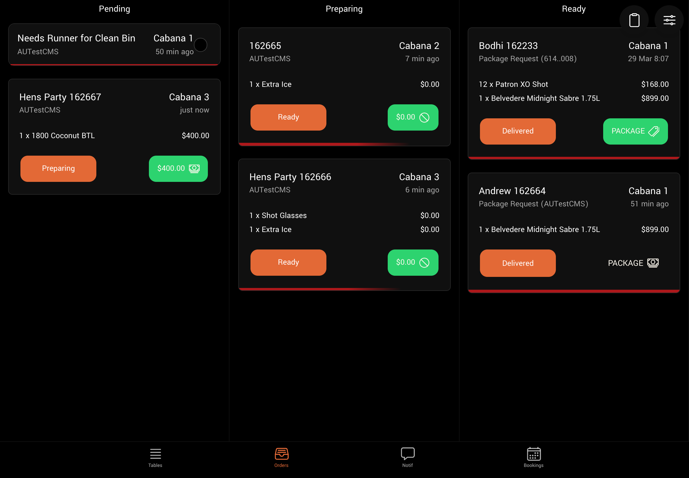
The DQ Orders tab (sometimes referred to as a “Bump” screen) has been designed to optimize the preparation and delivery of orders to tables within the venue. This document provides an overview of the screen layout, best practices, and how to customize it for your venue.
Order Status
| Status | Description |
|---|---|
| For Approval | The order has been paid and is awaiting approval from a manager before it can be handled. |
| Pending | Order has been submitted but has not been attended. |
| In Preparation | Order is being prepared. |
| Ready | Order is on its way to the table. |
| Delivered | Order has been delivered and no further action is required. |
| Cancelled | The order was cancelled. |
Columns
When viewed on a tablet device, the bump screen shows three columns by default: [Pending], [In Preparation], and [Ready]. The others are hidden to optimize performance and navigation. To hide or show columns, tap the “Filter” icon at the top right of the orders page and select the columns you want to display. On a mobile device, you can only select one column at a time.Locations & Filters
You can further filter the orders displayed on the bump screen. To access the filters and settings, tap the “Filter” icon at the top right of the orders page.| Filter | Description |
|---|---|
| Collections | Filter orders by those arising from one dispense or service area. |
| Table | Filter orders by one specific table. |
| Segment | Segments allow you to categorize orders based on their contents. Please contact us to set up filters by segment. |
| My Orders | Show only orders placed by you. This is useful for waiter users. |
| Paid Only | Show only orders that are fully paid or do not require payment. |
| Unpaid Only | Show only orders that require payment. |